Prerequisites
Read these first if Liquid Glass, Compose semantics, non-text contrast, Reduce Transparency, or Role.Button are new.
- Adopting Liquid Glass — Apple’s material for bars and controls; test with Reduce Transparency and Increase Contrast
- Compose semantics — the parallel tree TalkBack walks; it does not include how you drew the pixels
- WCAG 1.4.11 Non-text Contrast — 3:1 for the edge and state of a control against adjacent color
- HIG — Materials — glass as the navigation layer, not decoration in content
- Make composables more accessible —
Role,clickable, and why a custom chip is not a button until you say so
The screenshot looked finished. A mail-style thread, a floating glass tab bar, Inbox / Search / Compose. On a default simulator the bar reads as chrome you can tap. TalkBack on the same build landed on Compose and said “Compose.” No “Button.” No hint that double-tap activates anything.
Skeuomorphism — leather in 2012, Liquid Glass now — is an affordance for vision. Jetpack Compose already keeps a second UI for everyone else: the semantics tree. iOS 26’s Liquid Glass, and Material blur on Android, then add a third: the OS rewrites the pixels when someone turns on Reduce Transparency, Increase Contrast, or (on Android 16) Reduce blur effects. Reduce Transparency still leaves a bar — just not the one in the screenshot. TalkBack never had the glass at all. If “this is tappable” was encoded only in the material, two of those three UIs did not get the message you reviewed.
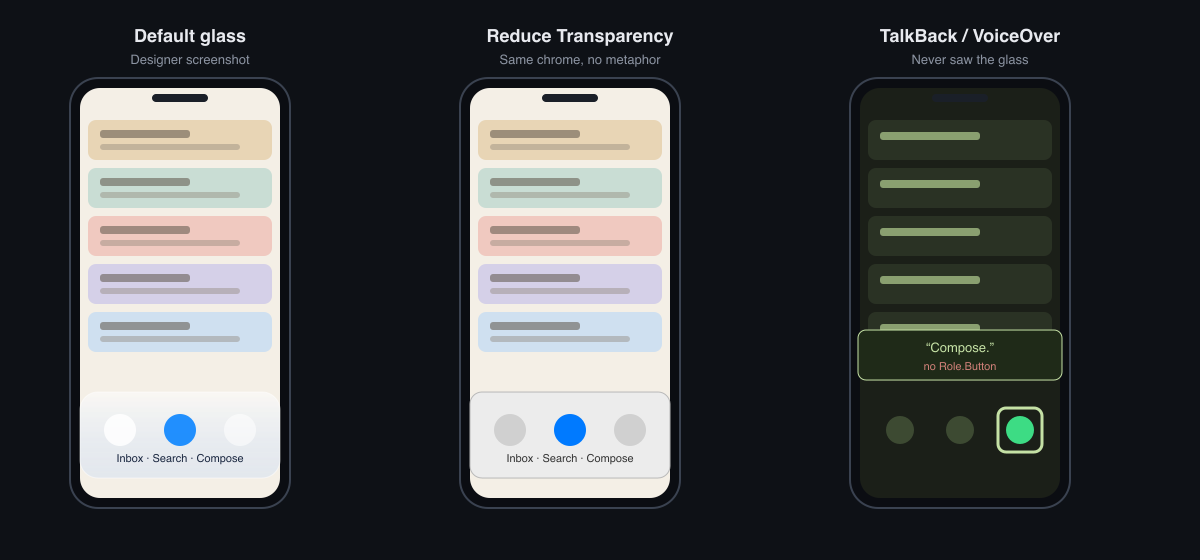
Figure 1. Same tab bar three ways. The middle phone still has chrome; it is just opaque. The right phone is focused on Compose and only hears the label.
Glass is a moving background
Apple is explicit: Liquid Glass is a functional layer for tab bars and chrome, sitting above content so the thread can peek through. That is a physical metaphor again — refraction, blur, float — just not a stitched calendar. Material 3 never sold leather; it sold tonal elevation, a color shift that stands in for a drop shadow. M3 Expressive is putting more press motion and shape-change back on the control. Different costume, same job: make a rectangle feel pressable.
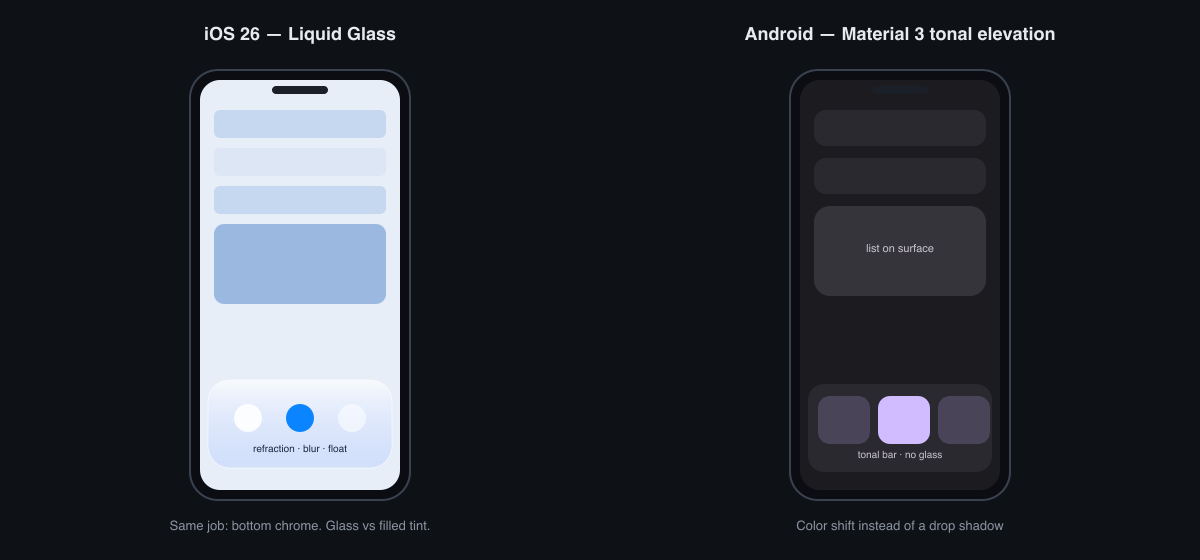
Figure 2. Same job — bottom chrome. iOS uses glass; Material 3 uses a filled tonal bar.
The a11y problem is not “glass looks fancy.” It is that contrast against a control edge is no longer a number you can screenshot once. WCAG 1.4.11 wants about 3:1 between the component and whatever is adjacent. Scroll a light thread under a glass bar and you might pass. Scroll a dark attachment or night-mode list under the same bar and the edge dissolves. The control did not change. The adjacent color did.
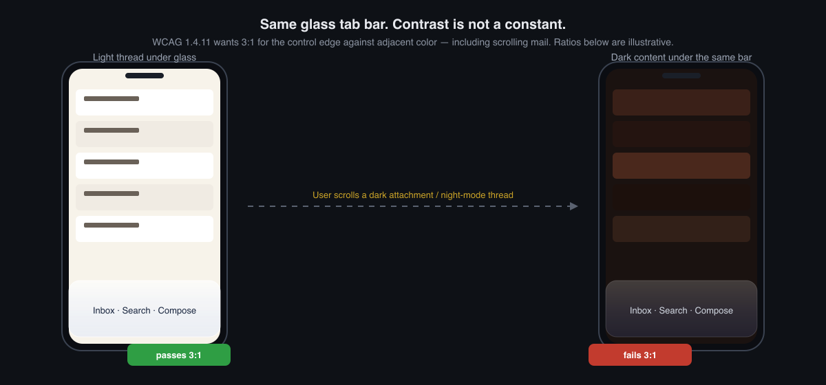
Figure 3. Non-text contrast on translucent chrome moves with the thread. The pass/fail chips are illustrative, not a lab audit of one screenshot.
Apple’s own adopting guide tells you to test custom glass with Reduce Transparency and Increase Contrast, because those settings remove or flatten the effect. iOS 26.1 even added Clear vs Tinted, and those appearance switches fight the a11y toggles. Android is catching up: Pixels grew a Reduce blur effects control under Accessibility, and Samsung has long had reduce transparency and blur. Custom Modifier.blur / RenderEffect in an app does not automatically follow any of that. You either draw an opaque fallback or you ship a smear that the people who needed the fallback still see.
TalkBack never subscribed to the metaphor
Compose is honest about the split. There is the composition you draw, and a semantics tree that accessibility services and UI tests walk. Shadows, glass, and elevation live in the first. Name, role, state, and actions live in the second. Same idea as naming the thing versus naming the look in CSS — the class that looks like a button is not a button until the tree says so.
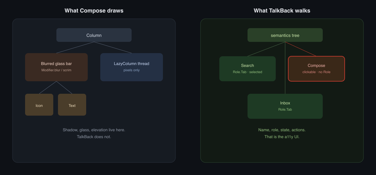
Figure 4. Modifier.blur is not a node TalkBack can announce. Search has Role.Tab. Compose in this tree is only clickable text.
That is why two Send chips can share a screenshot and fail different users:
Button(onClick = onSend) { Text("Send") }

Text(
    "Send",
    modifier = Modifier
        .background(MaterialTheme.colorScheme.primary, CircleShape)
        .clickable(onClick = onSend)
        .padding(horizontal = 24.dp, vertical = 12.dp),
    color = MaterialTheme.colorScheme.onPrimary,
)
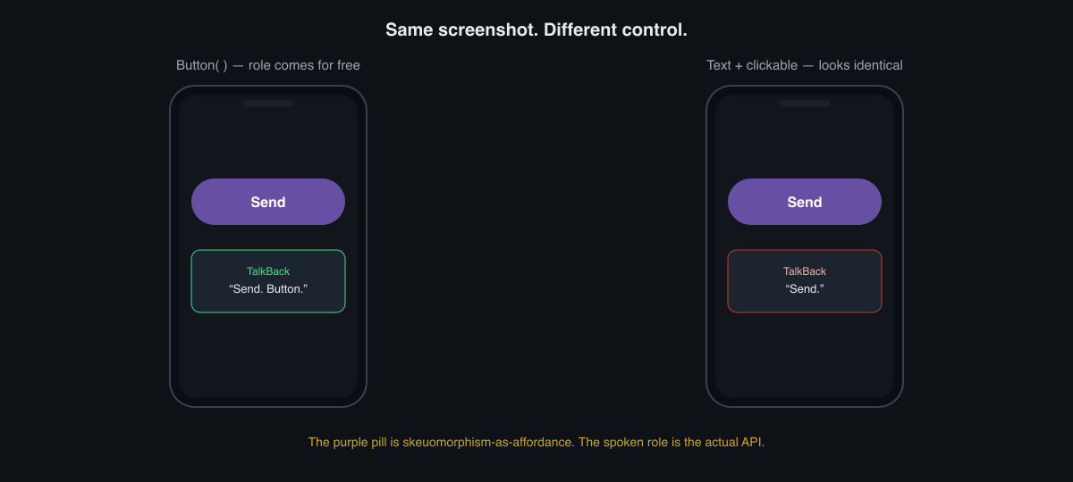
Figure 5. The pill shape is the affordance for eyes. The spoken role is the API.
Button fills in Role.Button. Modifier.clickable without a role often announces the text and stops. If you must custom-draw the glass chip, set the role explicitly — and give icon-only items a contentDescription that is the action, not the asset name.
Modifier.clickable(role = Role.Button, onClick = onSend)
VoiceOver is the same contract with different names: traits, accessibilityLabel, accessibilityAddTraits(.isButton). A glassEffect on a Text does not mint a button. Gesto was the other channel years ago — UI events as gesture and voice — which is a useful reminder that a lot of users never consumed the pixel metaphor in the first place.
You shipped three UIs whether you meant to
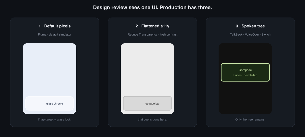
Figure 6. The control is still there in all three. What disappears is the glass-as-affordance cue — unless the tree already said Button.
A useful review is not “does glass look like the HIG.” It is: does this still parse as a control when the glass is gone, and does the tree already say what the glass was trying to say.
On iOS, read the environment instead of assuming the material survived:
@Environment(\.accessibilityReduceTransparency) private var reduceTransparency
@Environment(\.accessibilityContrast) private var contrast
If reduceTransparency is on, do not keep a custom blur just because the default screenshot had one. Draw an opaque bar. Keep the same hit target and the same label.
On Android, Button / Tab / NavigationBar from Material already carry roles. The holes are custom chrome: a blurred Box over a LazyColumn, a tinted scrim that is the only edge of a FAB, a selected state that is only a glass highlight. AccessibilityManager.isHighTextContrastEnabled catches one flattening. The blur toggle is newer and still uneven across OEMs — which is an argument for your opaque fallback, not for waiting on the system to restyle a RenderEffect you invented.
I treat one screen as done when all three pass:
- Default pixels: the control has an edge at rest, not only on press, and the edge still reads after you scroll extreme content behind it.
- Flattened pixels: Reduce Transparency / Reduce blur / high contrast still leave a labeled control with a 48 dp target.
- Spoken tree: TalkBack or VoiceOver says the name and the role, and the focused rectangle matches the hit target — not a decorative blur view sitting one node higher.
Skeuomorphism can still help, narrowly: a pressed elevation, a selected tab that is more than a 2% tint, a focus ring that is not the same color as the glass highlight. That is affordance as state, which 1.4.11 actually cares about. Decoration that only exists in the designer’s default theme is the part that will not survive contact with a11y settings.
Wrap-up
Pick one glass bar in a current build. Turn on Reduce Transparency (or Reduce blur effects), then TalkBack. If either pass makes the control harder to find than the screenshot, the metaphor was doing work the tree and the fallback never got. Fix those two, and the glass can stay a costume.
References
- Applying Liquid Glass to custom views —
glassEffectis a material, not a role - Meet Liquid Glass (WWDC25) — Regular vs Clear; a11y settings flatten the material
accessibilityReduceTransparency— SwiftUI hook for the flattened UI- Material 3 in Compose — paired color roles so contrast is not an accident of dynamic color
- Gesto — UI events as gesture and voice; a channel that never used the bevel