
Prerequisites
Read these first if install prompts / smart banners, PWAs, or web-to-app are new.
- Smart App Banners (Apple) — the OS-provided install strip this post contrasts with custom nag UI
- PWA installation (web.dev) — installability vs a store APK, and why banners exist
- Web app manifest (web.dev) — how browsers decide an origin is installable
- Android App Links — HTTPS URLs that open the installed app (after install, not the nag itself)
The install funnel nobody measures end-to-end
Desktop-era services assumed users would bookmark a URL. Mobile shifted the default to installed apps — push, home-screen presence, sensors, in-app purchase. Product teams respond by plastering “Get the app” everywhere on mobile web. Click-to-install rates look depressing (Branch’s web-to-app benchmarks often cite low single-digit web-to-store conversion), so growth teams escalate UI aggression: full-screen blocks, persistent bottom sheets, smart banners.
The failure mode is not “users didn’t see the CTA.” It is you interrupted someone who already had a job to finish on web — read a message, complete a checkout, approve a booking — and they bounced instead of installing. This post is about formats for converting existing web users, not paid acquisition (AppsFlyer, Singular, etc.).
At Breeding (dog owner ↔ trainer marketplace), mobile web was how trainers checked schedules between sessions; hammering them with install interstitials on every visit would have killed the habit we needed before we earned store install. The pattern generalizes: web-to-app UX is a retention tradeoff, not a billboard.
Why formats matter more than copy
Enticing copy and reward offers help, but frequency and surface area dominate. A Firebase Dynamic Link or OneLink URL is easy; choosing when and how much screen you steal is harder.
Three patterns show up constantly:
Full-page interstitial
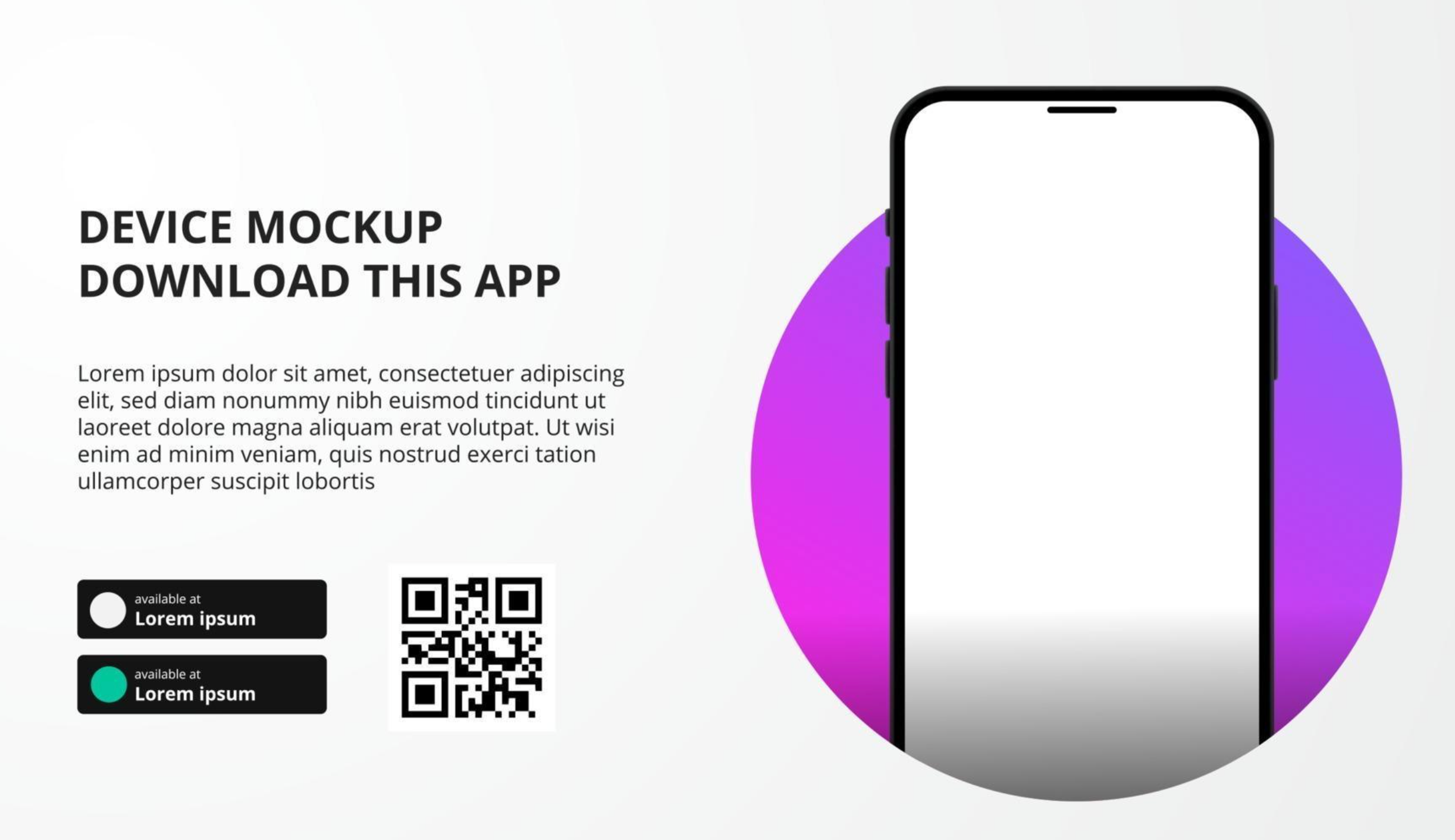
Figure 1. Full-page interstitial — high visibility, high interruption cost.
The entire viewport pushes web content aside until the user taps “Open in app,” “Install,” or “Not now.”
Upside: Highest raw click-through; good for first visit or post-registration when intent is forming.
Downside: Blocks the task the user came for; correlates with bounce and negative sentiment if repeated. Google’s intrusive interstitial guidance penalizes aggressive mobile interstitials on search landing pages.
Use sparingly: onboarding completion, deep-linked content that truly requires the app, or one-time campaigns — not every mail read.
Bottom sheet
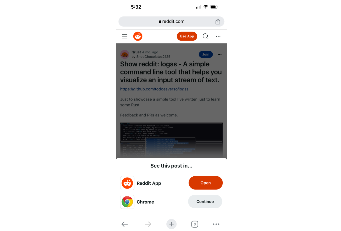
Figure 2. Bottom sheet — partial screen, thumb-zone CTA.
A panel slides up from the bottom (sometimes persistent until dismissed).
Upside: User can still see web content; common when mobile web detects “this page exists in the app” (articles, messages, product detail).
Downside: Persistent sheets annoy power users; competes with cookie banners and tab bars. Some teams leave a slim sheet visible for the whole session to maximize impressions — that trades install clicks for session quality.
Design note: Match persistence to visit frequency. Daily web users need fewer, smarter prompts than once-a-quarter visitors.
Smart banner
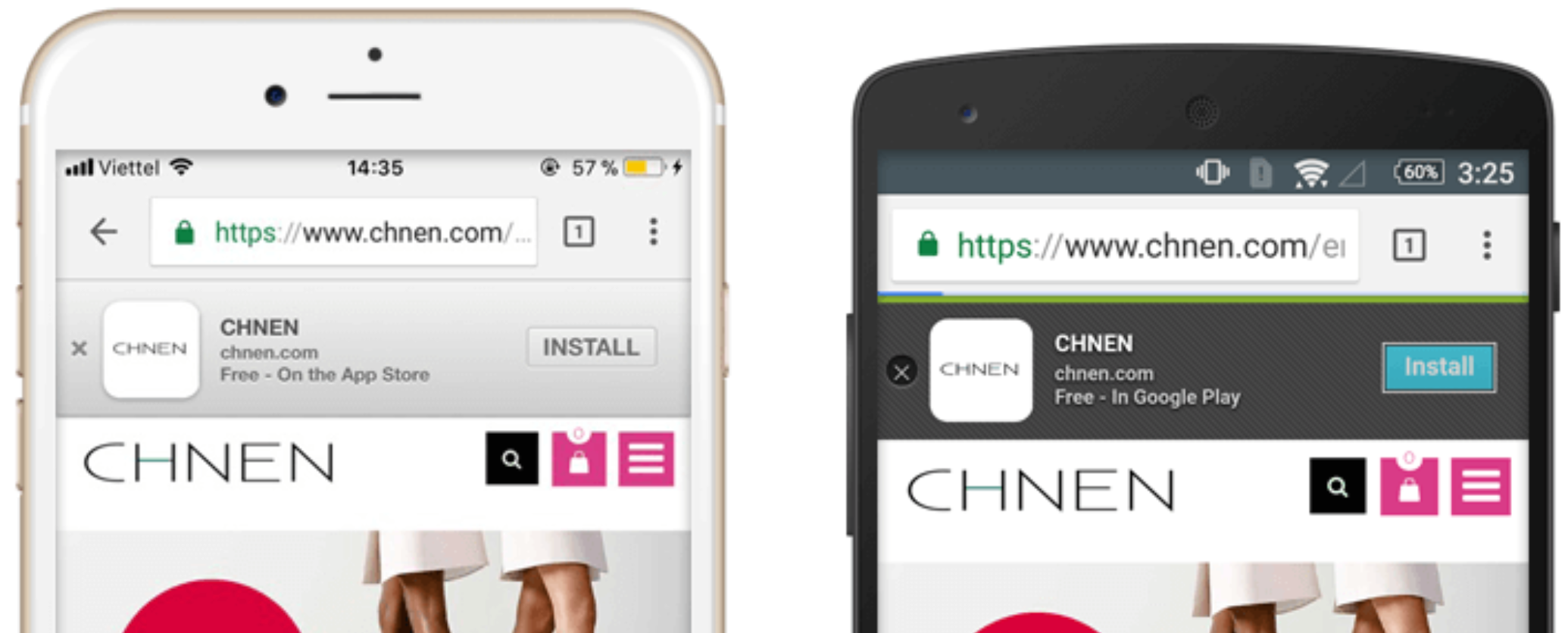
Figure 3. Browser smart banner — scrolls with content, lowest footprint.
Safari supports Smart App Banners via apple-itunes-app meta tags. Chrome on Android has no identical standard; teams use third-party snippets or MMP-hosted banners (e.g. AppsFlyer Smart Banners).
Upside: Least intrusive; scrolls away; familiar on iOS; safer for SEO and engagement metrics than full interstitials (Tolinku banner vs interstitial analysis).
Downside: Lower CTR; easy to ignore; Android implementation is fragmented.
A/B testing — measure installs, not banner taps
Teams bucket users and test:
- Timing: first session vs Nth page view vs after a conversion event
- Format: interstitial vs sheet vs banner
- Persistence: dismiss forever vs snooze 7 days
- Copy / incentive: “Continue in app” vs “Get notifications”
Web-side tools (Optimizely, VWO, in-house flags) can split UI easily. The hard part is closing the loop on the app: pass a variant ID through your deferred deep link so installs attribute to the prompt version, not just the click.
| Metric | Why it matters |
|---|---|
| Impression → store click | Top-of-funnel |
| Click → install | Store friction |
| Install → D7 active | Whether the nag attracted the right users |
| Web session length / return rate | Cost of annoyance |
Interstitials often win CTR; banners sometimes win retained installers because taps are intentional, not accidental (Tolinku). Pick the metric that matches your business before declaring a winner.
Wrap-up
There is no universal “best” install prompt — only fit for user occasion. Full-page interstitials buy visibility at retention risk; bottom sheets split the difference; smart banners protect the web experience on iOS especially. Default to the least intrusive format that still moves your KPI, instrument through install, and A/B test on downstream activity, not banner vanity metrics. The user who needed web today might install tomorrow — unless you teach them to leave.